Currently reading: Inside job: The rapidly changing world of car interior design
Complaints about the evolution of car cockpit design are only becoming louder. We consider how today’s conflicting ambitions can be reconciled

It has always struck me as strange that when we think of the cars whose appearance we like, especially if we’re deciding whether to buy one or not, it’s always the exterior we find ourselves considering. Why? I guess it’s because, consciously or not, we’re keen to project the right image of ourselves. But the truth is that once our cars are bought, we spend hardly any time looking at them, whereas we literally live in their interiors, whose design by comparison we barely think through at all.

Yet interior design has undergone a revolution over the past generation. Time was when interiors were scarcely styled at all, at least from the point of view of the driving environment. Instruments were placed wherever was easy and a dashboard created around them. Then, in the 1970s and 1980s, a certain sense of ergonomic cohesion was gradually introduced, but it wasn’t until this century that mainstream manufacturers started thinking as hard about the look of their cars within as without.

And with good reason. First, an interior is far harder to design, because unlike an exterior which is just a relatively simple shape, an interior contains a whole host of competing interests, from dials and switches to the dashboard and infotainment system, all arguing over the same small amount of space.

17 Bmw m2

But as journeys have lengthened yet traffic slowed and we’ve spent more and more time looking at our interiors, merely making it functional was never going to be enough. It had to offer a pleasant place to sit and while away all that time. Not least because of the quality of the items with which we now fill out homes, be they sleek music systems, flatscreen televisions or smart and minimalist phones. It simply won’t wash any longer to leave that kind of environment and go and sit in the motoring equivalent of student digs.

There’s one more consideration: so much of a car’s exterior is now governed by the legislative rulebook that it’s becoming ever harder to create genuinely beautiful and distinctive exteriors, hence all those jelly-mould crossover SUVs we have these days. But there remains far more scope for creative expression on the inside, so that’s where car manufacturers keen on carving an identity for themselves are increasingly concentrating.

Back to top

But so too is that job getting harder. Interiors aren’t exempt from the forces of law, but that’s really only where the problems start. There’s now so much stuff that we expect to find in our cabins that packaging it all within the legislative framework is becoming an increasingly fraught business.

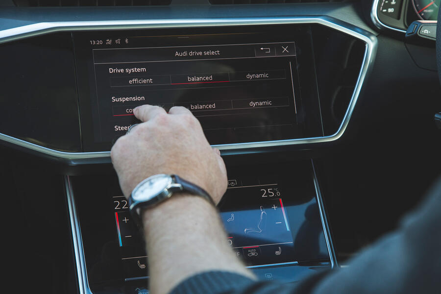
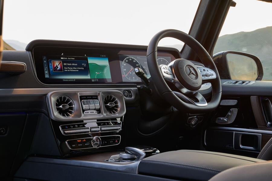
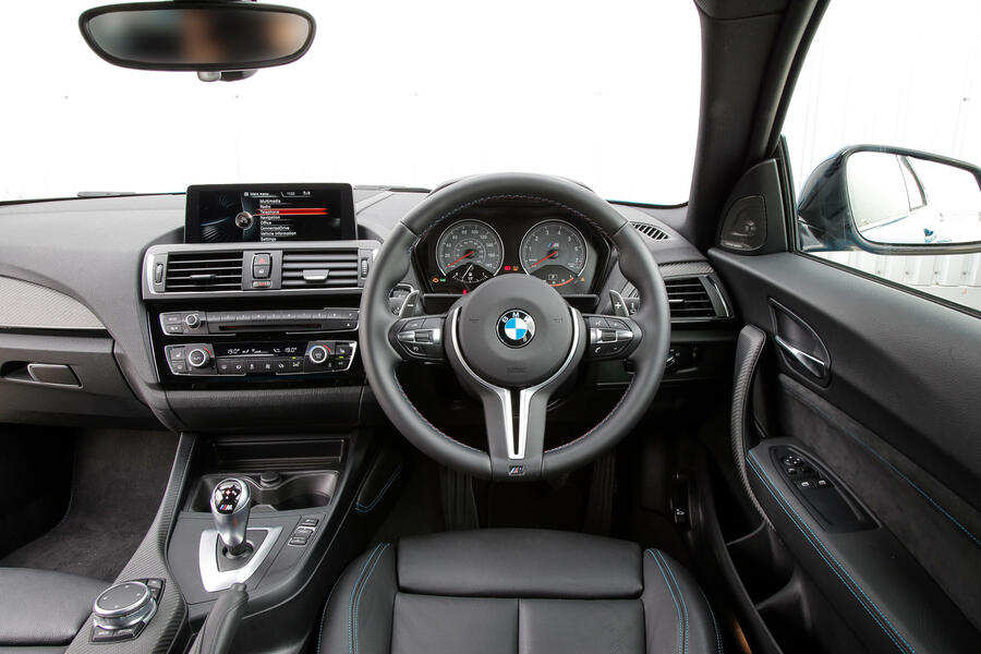
Remember when you would get into your car and every single thing you needed to do, from adjusting the treble on your stereo to turning down the heating a touch, could be accomplished with a single action: the turn of a knob or the flick of a dial? Things are rarely so easy today. We live in an era where function follows form at a deferential distance, so the price paid for a nice, clean-looking fascia with the minimum number of controls is that even some quite fundamental functions require you to go rummaging around in endless menus to locate them.

Say you want to turn off the stability control in Volkswagen’s new Golf GTI. You would like to just press a button and see a little light appear on the dash, but these days that would be far too easy. First you must find the vehicle settings menu on the glossy touchscreen in front of you. Once you’ve done that, you need to keep swiping until you find the page concerning the brakes. Yes, the brakes. Only then do you get to tell the car you would like to turn off the ESC. Does it do it? Of course not. It first tells you this is a bad idea that it doesn’t recommend and insists you confirm your wilful recklessness before it will grudgingly do as you ask.

So what are the most important priorities of a car interior? To me, job one is visibility. If you can’t see out properly, you’re unlikely ever to be truly comfortable – and that’s becoming increasingly difficult, because car manufacturers make ever-thicker A- and B-pillars to help their cars’ crash performance, apparently without considering how much more likely it is that their cars will crash as a result. And there’s no excuse: even two-seat mid-engined supercars can feel like goldfish bowls if properly designed, as anyone who has sat in a McLaren will tell you.

18 Aston martin db11

Back to top

But in many important regards, interiors have progressed beyond all recognition. When I started doing this job in the late 1980s, many cars weren’t even symmetrical, meaning the driving position could be radically different depending on whether the car you drove was left-or right-hand drive. Pedals nowhere near where your feet naturally fell were common, as were seats that weren’t actually directly in front of the steering wheel. Steering wheels that adjusted in any direction at all were the exception, not the norm they are today. I may be critical of the latest Golf’s subsystems, but the way the car presents its primary controls to the driver – pedals, steering wheel and gearlever – is impeccable.

One important area in which we seem to be regressing, however, is the design of the instrument pack, or IP, as it’s known in the trade. Some might raise an eyebrow at this, knowing how beautiful those ultra-high-definition screens that are rapidly replacing conventional clocks can look. And I agree: some are excellent. But others aren’t, and I’ll cite BMW as an example only because there was a time when its IPs were without doubt the best in the world. But, having tried to get used to its new design philosophy, where the electronic needles only sweep through a limited arc right around the outside of the IP cluster, I recently climbed into an BMW M2 that still uses the old tech and found myself wondering what on earth was so wrong with BMW’s simple, circular dials that it had to change. I’m still trying to figure that one out.

But automotive interior design must at times feel like a thankless task. The customer wants more of everything: more gadgets, more information, more entertainment (don’t get me started on apps), yet they also demand presentation as clean as it is on their smartphones. The only difference is this: it doesn’t matter how much time you spend looking at your smartphone at home, but it matters a very great deal how much time you spend looking at your smart screen in the car you’re driving. And yes, voice recognition and even gesture control can help, but they’re at best useful extras, not complete solutions in themselves.

As ever, then, the best interiors are those that strike the correct compromise between ease of use and appearance. It’s tempting to say that everything should have its own, separate, one-touch control, but that would lead to an interior plastered with buttons that could be completely confusing too. Alternatively, a car with no buttons or similar controls might look stunning but, in reality, would likely be difficult and time-consuming to operate.

Back to top

16 Touhscreens

With each new car I drive today, I now configure its control systems the way I want them to be before I set off, which may add between five and 10 minutes to my journey. And I know that if I stop even for five minutes to grab a sandwich, half the systems I’ve disabled will have turned themselves back on again by the time I’ve got back on board. The car will have taken itself out of Dynamic driving mode, turned its stability control fully on again and reactivated its hateful lane-keeping assistance function. So I have to do it all over again. This has little to do with the manufacturer trying to stop you having a crash and almost everything to do with removing grounds for you to sue them if you do.

For me, and because I’m old, I would give up all the gadgets and swanky screens in favour of interiors with a limited number of clearly labelled, logically arranged switches. Twenty years ago, that was simply common sense. Today, it sounds like a revolution. Which is why it’s never going to happen.

What should happen next?

How do we resolve the conflicting interests of the demand for more content and the desire for cleaner cockpits? Truly intelligent voice recognition has a role to play, but I’m increasingly minded to think that the only way to create the space we need on the dash for comprehensive yet easily understood and accessed functionality and information is to migrate the dials onto the screen.

Back to top

The information on current head-up displays duplicates what’s already shown in the IP. There’s no longer space for such redundancy; if the data I need is on the screen, I never look for it anywhere else, because that’s where my eyes are already pointing. So ditch conventional instruments, project all their data on the screen and use the space you save to create a driving environment that’s as easy to operate as it is attractive.

The best and worst interiors

13 Honda e

Honda E: Wall-to-wall digital screens, including monitors for the video cameras that supplant wing mirrors, could be the ultimate form-over-function folly. But in the simple little Honda, it’s all easy to understand and works really well.

12 Mazda mx 5

Back to top

Mazda MX-5 (ND): Has beautifully legible analogue instruments with chunky, easily operated switchgear for all major functions, with less important operations accessed via a simple controller and a clear screen. There’s very little not to like here.

11 Aston martin db9

Aston Martin DB9: Some will look askance at this choice, because the DB9’s cabin was truly beautiful, but few who have actually driven one. With illegible instruments, tiny buttons and the worst sat-nav on record, it proved beyond doubt that just because it looks right, doesn’t necessarily mean it will be right.

10 Mercedes g class

Back to top

Mercedes-Benz G-Class: Probably the best blend of tradition and tech. It has a beautifully clear screen with plenty of customisation opportunities yet is very simple and intuitive to operate through the uncomplicated Comand controller.

Lancia Trevi: If you’re one of those poor souls who has a phobia of holes, look away now. If you thought the exterior of the Trevi saloon was ugly, it was nothing compared with the interior whose pockmarked dashboard appeared to have caught the bubonic plague.

BMW 7 Series (E65): To say that BMW’s iDrive system had a troubled childhood is a gross understatement. Twenty years ago, a single controller that moved in eight directions to control all ancillary operations was a recipe for absolute ergonomic disaster, and the E65 7 Series duly delivered exactly that.

READ MORE

Inside story: The best car interiors of all time 

How car interiors changed since 1928 

Updated Honda Civic gets styling and interior tweaks

Join the debate

Comments
23
Add a comment…
Speedraser 1 February 2021

AF, I have to disagree with your inclusion of the DB9's interior as an example of one that doesn't work. I speak from experience - I have a V8 Vantage that I bought new in 2009 (with the later, DBS-style center stack). The instruments are NOT impossible to read, though they are absolutely gorgeous. Only the analog speedo is hard to read at a glance. It reads, unnecessarily, to 220 mph, so the is compressed. It's a non-issue, though, because there is also a large and very clear digital speed display. The other gauges are easy to read. Regarding the switchgear, there are large knobs for adjusting the most-frequently adjusted items, such as temperature and air distribution, radio volume, etc. And yes, there is just one large button that needs to be pushed to switch off the stability control. There are numerous small and more fiddly buttons for other things, but familiarity makes that a non-issue.

kowalski99 31 January 2021
I'm considering getting a new Astra partly because of this. Very ergonomic interior. Plus a huge saving making it as cheap add an i10.
Peter Cavellini 31 January 2021

I seem to remember Saab, remember them, had a facility where at Night you could switch of most of the dash, and only have the speedo working?

richardherriott 1 February 2021

Yes, the night driving function. It was among several nice ideas from Saab whose dashboards were always designed around ergonomic facts. The old 900 dashboard was superb.

Citroen got a lot of stick for some of their controls. They were ergnomic but not immediately easy to work. Once you learned them they were more effective than easily-learned solutions.  Design researchers know this phenomenon, the trade off between ease of learning versus effectiveness in use.  Once you´ve learned the details of the CX controls other ones seem a bit stupid. I rather wish it was was possible to offer customers the choice of easy-to-learn or effective-to-use.  Why not offer a choice of control designs?  I don´t mean something buried in menus but physical buttons and switches in modular assemblies.