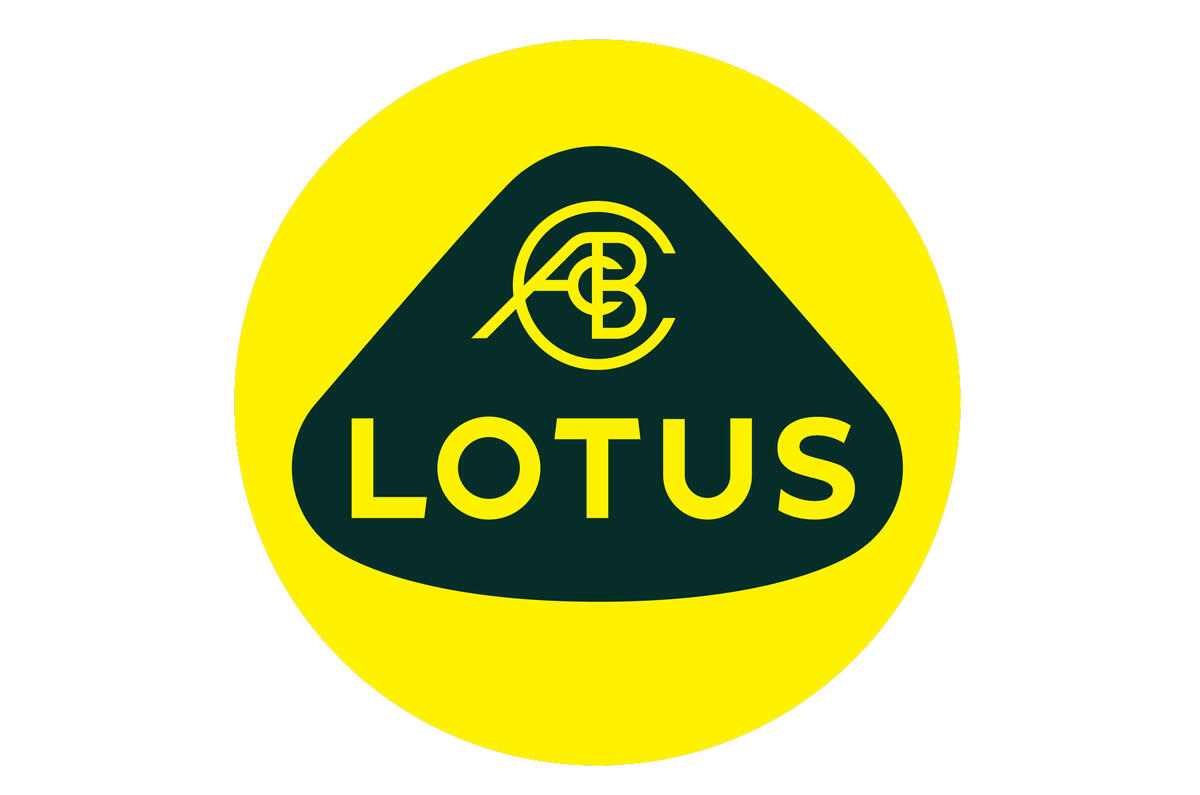


Lotus has unveiled a revised version of its roundel logo as it continues its revamp and revival under new ownership.
The Norfolk-based brand was bought by Chinese firm Geely, which also owns Volvo, in 2017. It has since developed the 1973bhp Evija electric hypercar as the flagship for a major line-up revamp, which will also include the brand’s first SUV.
To reflect the changes, Lotus has tweaked the famous roundel that has been used in various forms since Colin Chapman founded the firm in 1948. While maintaining the classic design, the logo has been simplified using just two bold colours – the firm’s classic British Racing Green and yellow – and the straightening of the 'Lotus' wording.
Marketing chief Simon Clare said the firm "looked back at the original Lotus roundel and thought about Colin Chapman’s philosophy: to simplify and add lightness.”
Lotus at 70: the highs and lows
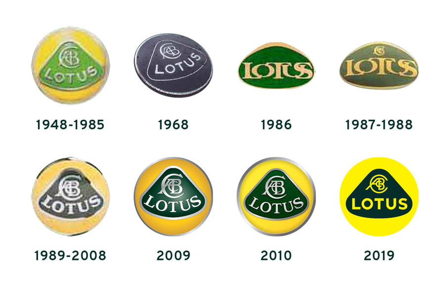
The new insignia is the eight variation of the roundel to be used over the years. The initial design was used from 1948 to 1985, featuring the Lotus name and an emblem formed by the intertwined initials of Anthony Colin Bruce Chapman. The only exception was in 1968, when the firm tried a black-and-white version.
A new roundel featuring bold overlapping lettering and no intertwined initials was introduced in 1986. The 'ACBC' symbol returned the following year, before the classic design was brought back in 1989. It then underwent minor revamps in 2009 and 2010.
The new logo was unveiled at the same time as Lotus announced a deal with nearby Premier League football club Norwich City that will involve the car maker sponsoring the team’s academy sides.


Join the debate
Add your comment
Clean, simple, and back to a
Clean, simple, and back to a sans-serif font, as used in the 1960s.
Next please: wearing that badge, a truly desirable car I want to buy.
I fear that few will really care
That said Geely has been on a roll with their acquisitions turn around performance. Hopefully this will cement Lotus financially for the long haul.
I think the 2010 logo was best
They should stay with the 2010 logo it was the best and has lasted nearly a decade.
One company I would love to see revamp there logo is KIA. Not sure what I would do but never liked the logo they currently have. Iveco and Izuzu are two more that could do with new logo's.
I would llove to see Ford revamp there logo too make it bigger and make it more 3D like.