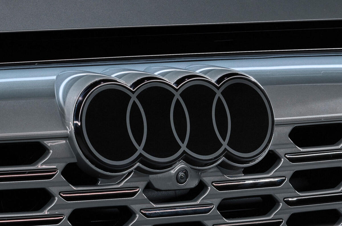
Audi has today provided a closer look at its new logo, which does away with three-dimensional chrome in favour of a more 'discreet' monochrome identity.
The new logo reflects the brand’s push into more expensive markets with what is intended to be a more understated identity, said brand strategist Frederik Kalisch.


Join the debate
Add your comment
Bit of a shame this. They've now made it so you can't see the badge until you are very close to it. I've always liked a bit of chrome on a car, but then I am a dinosaur!